
A New Look for Bonanza: Refreshing the Homepage and Navigation
Over the past few months, we’ve been exploring ways to improve and refresh important sections of Bonanza. In August, we took on the most visible portion of the site — the homepage and navigation. Our concept focused on revitalizing the look and feel and presenting a more complete picture of Bonanza’s extraordinary marketplace and community. We think these changes will be a great improvement, and we’re excited to announce that they’re now live.
Exploring the new homepage

The most noticeable change is the new design for the homepage. After a comprehensive review of the page, we realized we could do a better job of representing the Bonanza experience. We wanted to articulate what our marketplace has to offer buyers and sellers and present this in a way that was both contemporary and uniquely Bonanza.
Like the previous page, this new design features search, hand-picked lists, and major categories. We’ve also added new sections for testimonials, seasonal promotions, and other great Bonanza tools. These additional sections will help us keep fresh, relevant information on the homepage.
Discovering new ways to shop

While exploring new treatments for the homepage, we also began examining the navigation. At first, we just wanted to make the page header feel consistent with the new homepage and allow it to scale across different screen sizes. Once we got deeper into the design review, we realized we had opportunities to improve the navigation beyond the look and feel.
After reviewing user feedback, analytics, and competitors, we saw there were opportunities to make shopping our many categories easier. We took the top categories listed in the “Browse” dropdown, and listed them prominently in the header. This new format allowed us to show many more options. We featured subcategories, brands, and deals for our major categories, and also exposed some of the other popular categories that had been hidden away.
We think this new shopping navigation will be a big improvement both for branding and usability. It gives visitors a clearer picture of everything they can find on Bonanza and makes it quicker to scan and find the right category.
Getting around in your account

The third part of the project focused on the user account navigation. When we launched the new My Bonanza page, we were fortunate to get a lot of great feedback. The insight we got from our community really helped us determine what we should explore and how we could try to improve it.
The account navigation features the same basic set of links. We consolidated important actions into two groups (“My Sales” and “My Bonanza”), aligning them with the taxonomy of new dashboards. We added a larger set of options under the “Help” menu, including a search feature and links to the community, feedback, and blog pages. We think this will make it easier to take important actions and find resources you need them.
Tell us what you think!
The homepage and navigation are now up and running. Check them out and let us know what you think! We’d love to hear your thoughts about the new design. The best place to provide feedback is in the Bonanza feedback forum.

Thanks for reading and for supporting Bonanza! Keep an eye on our blog for more helpful articles and updates coming soon.
<< Back
Recent Posts
Recent Outtage
Oct 29, 2025
Prime Days...on bMarkeptlace!
Jul 9, 2025
Father's Day promo
Jun 3, 2025
An Important Announcement from Our Team
May 13, 2025
Cleaning House: How We're Cracking Down on Fraud to Protect the Bonanza Community
Mar 26, 2025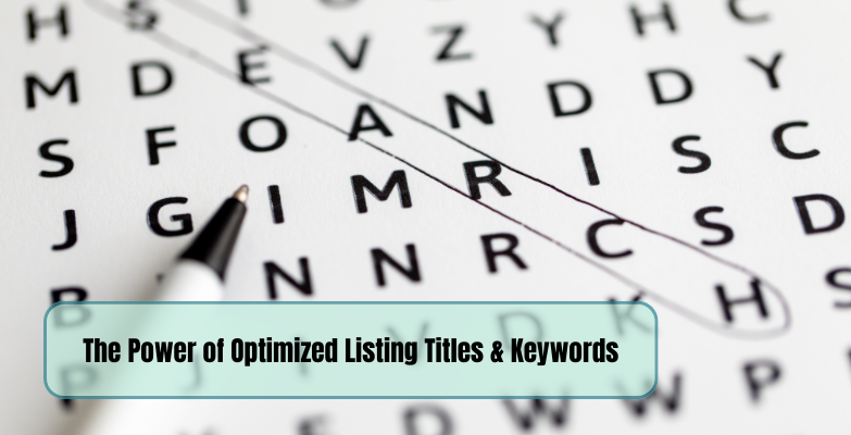
47 responses to A New Look for Bonanza: Refreshing the Homepage and Navigation
Just got the new look, I just wish Bonanza would spend some money advertising Bonanza instead so more people know what Bonanza is and where to find it.
Hey Gifts4u2, thanks for the feedback. Fortunately, “advertising” and keeping the site up to date is not an either/or proposition. We can, and do, move forward on both of those at all times. This year alone we will have spent around $2 million on advertising, which is about 10x what we spent just a couple years ago.
As a result of this, we have seen more and more of our sellers making sales over the past couple years. We fully agree with you that it’s important for us to continue to spread the Bonanza brand and make sure buyers find it. But we also know we have to always invest in making the site feel clean and modern if we want those buyers to come back.
Where is the Dolls & Bears category? I have to search vintage barbie and eventually I find it.
I don’t like the categories across the top either. They aren’t my booths categories. Although it may not matter if buyers can’t find my booth anyway.
Wow, when I opened up the site, it was like…Surprise! It brought a smile to my face. I like the sleek and modern new look.
I have to say that the categories placed at the top of the booth are confusing. If I was a Buyer I’d click on one of those categories thinking they were part of the Seller’s booth options. Instead it takes the Buyer out of the booth. Other than that it looks nice.
I had a possible returning Bonanzler tell me last night they they were so overwhelmed by all the changes that have happened while they were gone they didn’t know if they did want to start back up with selling here. Most of the changes have been for the good but as I found out, it can also set some people back some. I like everything and that you are trying to improve Bonanza. Please work on the app for being able to list from our phones to make things even easier for adding new listings to our stores. Thank you for all you have done so far here.
Thank you for your comments and for your support. In addition to the regular Bonanza site, we are actively improving our sellers mobile app on a full time basis so please make sure to visit it often.
I must admit I don’t like the Categories across the top either for all the same reasons mentioned. It’s fine for the home page but not the booths. Other than that It’s just more changes for everyone to get used to. Hopefully the changes were made to help increase sales.
To those concerned about the categories: We’re going to be keeping a close eye on our conversion rate in the next couple days to gauge whether this does indeed pose a problem to incoming shoppers. If the data says that it does, then we’ll probably do something like tammiestreasures suggests – to only show the categories on select pages where the buyer is in more of a “browsing” mindset.
We appreciate the feedback though, we’ll be keeping a close eye on the data to determine whether the concerns about shoppers getting distracted come to pass.
Under home and garden – top Brands…Lenox is mis spelled
Lennox….
Under Home and Garden Top Brands Lenox is misspelled Lennox
Thanks for the heads up! It’s now fixed.
I agree about having the categories listed in the booths like you do. There is nothing that notes those are not categories in a specific booth (that they are visiting). I could see that being a problem and many people (potential buyers) becoming frustrated because they were moved out of the booth by clicking on a category.
I like the look, but I do have a problem with the landing page. Folks who do not sell on Bonanza would not know how to get to anyone’s booth. We sellers know to click on the name after Sold by…. but I doubt a stranger would. Now it takes you to the profile page and if you have anything written in the About Me section, the booth items available are invisible unless you know to scroll down. I think where it says Ask Seller A Question (on the landing page)(In Capital Letters) should be something like; Visit seller;s Booth. (I’m not talking about the Bonanza home page; I’m talking about when someone lands on your item page.) It is very confusing on how to get to the sellers other items.
Long time @nightrunway, nice to eSee you Thanks for your feedback. As Bill mentioned above, we are paying close attention to conversion rates and other metrics and also the feedback of our community. As with any changes we make, our goal is to get you the most sales that we can so please do keep the feedback coming and thanks so much for your continued support.
The new look is sleek and modern, great job, but IMHO less “seller friendly.”
1.PLEASE remove the categories in our booths, it is confusing. I had a buyer who was trying to purchase an item today and could not find it. She sent me an email and requested a link to the item. Still has not purchased
it. She was clicking top categories in my store.
2. Seller categories at top of page are confusing. I could not find MY BOOTH, finally found it under MY SALES. Can you place MY BOOTH and BOOTH OPTIONS under MY BONANZA rather than under MY SALES? Also had a hard time finding add or edit an item, again it is under “My Sales”.
3. It is difficult for a buyer to find a way to view all items in a sellers store without a bit of navigation if they come into Bonanza via a social media direct link.
Would it be possible to put a link to all sellers items near the top of the item page?
Example: a shopper clicks a Pinterest or Twitter link to
view an item
http://www.bonanza.com/listings/Jelly-Belly-Cotton-Candy-Machine-plus-Cotton-Candy-Kit/275418061
IF this buyer wanted to see other items from THIS seller, the only categories they will see to click on will take them out of my store. There is nowhere for them to click SEE SELLERS OTHER ITEMS, unless they scroll way to the bottom of the page.
Hi MTT, Thanks for the feedback. To address your points:
1. We’re evaluating different treatments that we might do for the categories on booth and item pages. This will partially be driven by the data we observe, but we do acknowledge the pattern of confusion amongst some sellers about what the categories filter down to.
2. We’re hoping that it becomes intuitive to have any sort of seller-based function you could need under the same label. “My sales” seemed relevant but perhaps something like “My booth,” “My store” or “Selling” would be even more clear.
3. The item page is unchanged, so I presume this feedback is just in general? Anyone with a membership can configure the right side of their item page to link to other items in their store. And of course those items are also at the bottom of the page. So between having them on the right and on the bottom, it seems like the only other place we could put other related seller items would be at the top of the page, but that feels excessive.
Thanks again for your feedback and continued patronage of Bonanza!
I had just sold something and tried to look what it was, it was like oh wow this is different! It looks great! i love it!
See? Our changes are already paying dividends Congrats on your sale and may many more come your way. We’re feeling the love @Vintag3eArray, thank you.
Beautiful new look !
The layout , quick navigation with hardly a move of the mouse is great .
Nice to see the categories as well before hitting search.
I love it, thanks guys
Mom? Is that you?
All joking aside, thanks so much @cjazzcarolina We appreciate the kind words and we are glad you are enjoying the new features
This new page came as a surprise and looks promising. I do wish though that some immediate attention be given (before the Xmas Rush) to adding Priority Regional Box A and B Boxes along with the other missing Priority Flat Rate options (like Legal F/R and the Padded F/R envelopes) to help the sellers to keep ever rising shipping costs down for the buyers. Also CALCULATED Parcel Select shipping would be a nice shipping option addition as these have been out a few years now and not going away.
Thanks
Thanks for the feedback and your suggestion about adding additional shipping options. We are basically showing you the options that are fed to us via USPS and UPS’s commercial API’s. We will be sure to have a look on our side to make sure we are doing everything we can on that front.
Was open minded about the last changes, unusual for me :-) but this update is not good. Most important of anything is that anything that takes a buyer out of my booth is a bad thing! Categories at top of booth page need to go. Being a creature of habit I’m sure I’ll adjust to where to find other daily used features but really had to flounder around this morning to even get to here! Couldn’t find where to add/edit items- seems should be in My Bonanza Dashboard not My Sales- to me “my sales” means what I’ve sold and the usual things that includes- messages, seeing the orders, invoicing etc (do like the new feature of list of sold and list of shipped etc). My Bonanza dashboard should be my working categories- add items, edit items, batch edit, my fees etc. Major dip in yesterday’s looks, ad views etc (never really high but have been steady and sales up since last changes)- really worried about that category thing taking people out of our booth. Please rethink that first- like Pavlov’s dogs I will find my way around eventually.
Thank you for your feedback @gearseller2. We will be changing the “My Sales” command to “My Store” today. We are also keeping an eye on all other areas. Thanks for taking the time to let us know your ideas for how we can improve Bonanza. We value your feedback and appreciate your support.
Overall, I like the new homepage. Hand-picked list image bar at top looks great. Categories bar with slate-gray icons is wasted space that could show a product image for each category shown, instead of blank, boring icons. They are attractive, but looks incomplete, like an image placeholder.
Also, when you click on All Catagories and go to that page, the sub-cats listed as they are are overwhelming. A better format for that page would be to list sub-cats all in vertical under each category, and to have the categories running across the page in columns. Under that first row, place the next categories under it and running across the page, with the sub-cats running vertically under each category, all alphabetized. Would be a lot easier to read.
The current format, with those sub-cats in big chunks of block paragraphs, was just too much for me. I cringed and quickly left the page. I am thankful, however, for all of these sub-cats at B. Very helpful to not only buyer but me as a seller also.
Love the specific feedback @EmbellishMart, thank you!
I may have missed it , but a category for " Pet Supplies " ?
Thanks
We do have a category for Pet Supplies but it is not in the header along with some others. The selected categories show based on the quantity of items in them. The current header has more than 10X the categories of our last header. We will be sure to keep tabs on the performance of the current categories shown and make adjustments in the future.
I like the new look so far.
I agree that the categories at the top need something to separate them from a booth.
Also under “Sold by Abbystreasures” would like, “See all items in booth” and links to my other two booths.
It looks like you changed “Hand Picked Lists” to “My Hand Picked Lists”. So how do you get to all the hand picked lists now?
Oopsy, it looks like we may not have a direct way to access that page from the home page at the moment. You can toggle between the hand picked lists by clicking on the arrow on each side of the home page hand picked list. If you click on the title of the hand picked list you will be able to view that list. Top left side of that page you will see a link to the hand picked lists. You can also bookmark this: http://www.bonanza.com/hand_picked_lists
Lovin’ the new look, for the most part. I especially like the My Store area…everything in one shot! Not so sure about the Categories icons, though. I do think that actual items should be shown there. And, the categories at the top of our booths are VERY confusing. I think if you tweaked those two things, I’d LOVE it! Thanks for listening.
I like the new homepage.
My store (and not only) in one click – perfect.
Bill – “…perhaps something like “My booth,” “My store” or “Selling” would be even more clear.”
Mark – “We will be changing the “My Sales” command to “My Store” today.”
Thank You very much for so quick change, it’s much better this way.
Could the brown photo with the “Find everything but the ordinary” search box on it be much shorter? Just to see more front page items, as You used to show before.
Congratulations! Like many New Look ..
Please add a category of Mobiles Phones. Thanks
Overall, I don’t mind it; I’m sure it will just take a bit of getting used to.
I think the categories up top should only be on home pages, community, etc., but not while one is in a specific booth. I think it encourages people to leave a booth who has already worked to get the buyer in, and also, the buyer may not realize they are being re-directed to a different shop.
When I sign in, is there a way to go directly to My Bonanza? I always used to end up there, but now it goes to My Store, which isn’t seeing any action lately. It’s always an extra click to get where I really want to start my daily routine.
Thanks, and keep it up!
Thank you for your feedback. At the moment, you will land on the “My Store” tab on your My Bonanza page and there is not a way to default to the My Bonanza tab. Defaulting to the page with your most recent sales will help in the event you have not shipped an item, item stats, etc. I am sure there will be more action soon
Since now “My Store” and “My Store Dashboard” lead to the same place, could then “My Store” send us straight to the booth?
Thank You.
Not sure about that ArtistsUnion. The link just below your My Store Dashboard is the My Booth link (takes you straight to your booth).
I logged on this morning and thought I was somewhere else!Love the new look definitely has a clean and professional look.I like the easier navigation and pictures that pop up for each category.Keep up the good work.Hopefully this will cause more internet traffic to site.
Great job!!!!
We just came on board.Looks great. very user friendly. Looking forward to a long successful relationship.
Hi, overall I like the new look, but in terms of what the redesign will do for my booth, I am not optimistic. I sell books, magazines and comics, and I think the new design will only further marginalize those categories here at Bonanza.
I know only so much can be displayed on the front page without creating a cluttered look, so I understand not every seller can be made happy with the featured categories, but I did want to at least leave this reminder to the design team about us book sellers.
Maybe you could experiment by rotating the categories? Or maybe program a way so that returning clients will see categories in which they have purchased items in the past highlighted on their home page instead of a single standard view for all?
Thanks for the continuing efforts to improve the site. My sales are up quite a bit this year, but I know they could be much higher if more people could be made aware of Bonanza as a very good site on which to buy and sell books and such.
Like the changes so far – but MISS my Booth Avatar on the “listings” pages of my items – wish that would come back so they know that they are still in my booth. I find it difficult for the buyer (and me) to find their way back from an items listing to my booth. Thank you, sorry if this is a bit off topic, but we are talking changes.
My 2 cents on the general Bonanza categories at the top of the page of my booth – there must be a different way of doing this. JMHO
A sales ring(sound) notification will be nice in the app.
I love the new look. Thank you to the Bonanza team for your hard work. I realize there is still some areas to work on to better serve the Bonanza sellers and buyers. I agree with the other comments about viewing items for sale in a booth that we know as a seller to click on the sellers name, but the buyer who is not use to using this site would not know to click on the sellers booth name to continue shopping in the booth. I tested out a seller selling Antiques and I experienced the same issue. I wish for a button for example to continue shopping with this seller or move to the front page search page. I realize your team is keeping a close eye on this, but I hope this will be corrected sooner then later. Again, thank you!
I love the new look
Login to see more comments